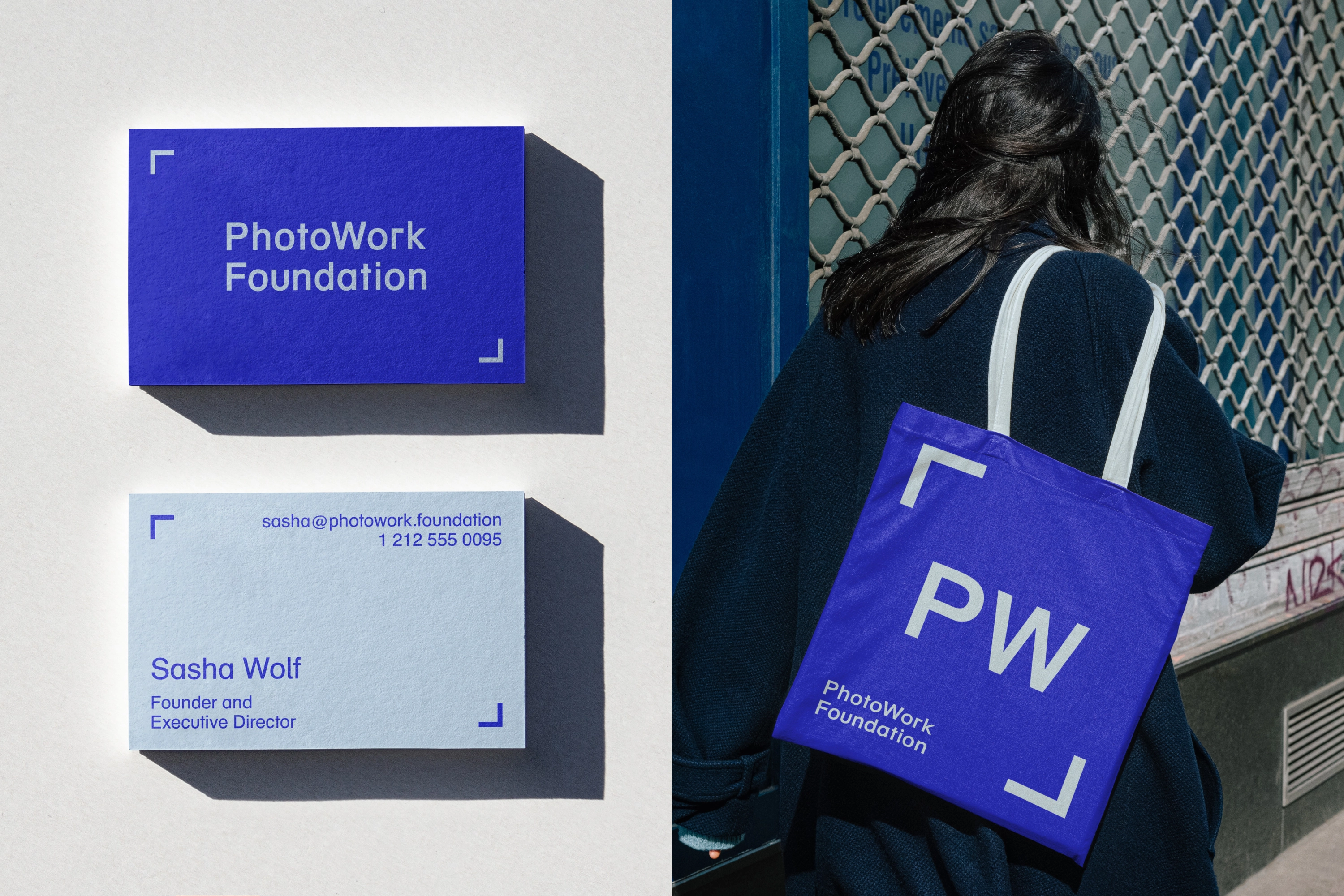
The PhotoWork Foundation is a non-profit established by gallerist Sasha Wolfe to support artists working in the post-documentary photographic tradition. Along with focusing on mentorship and grants, the non-profit also has a popular podcast.
Client: PhotoWork Foundation Designed with Dougal Henken
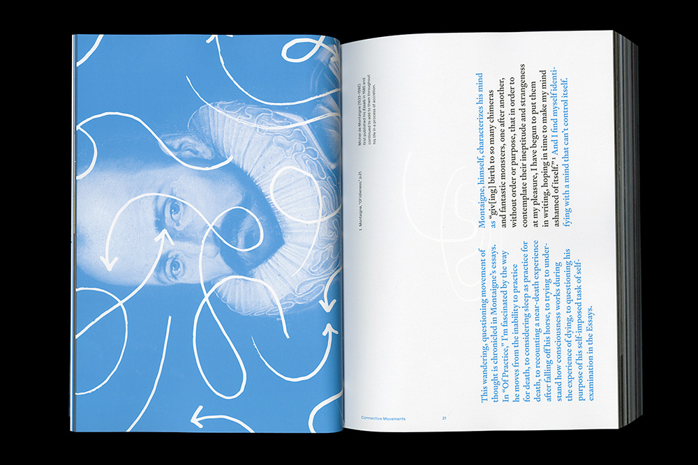
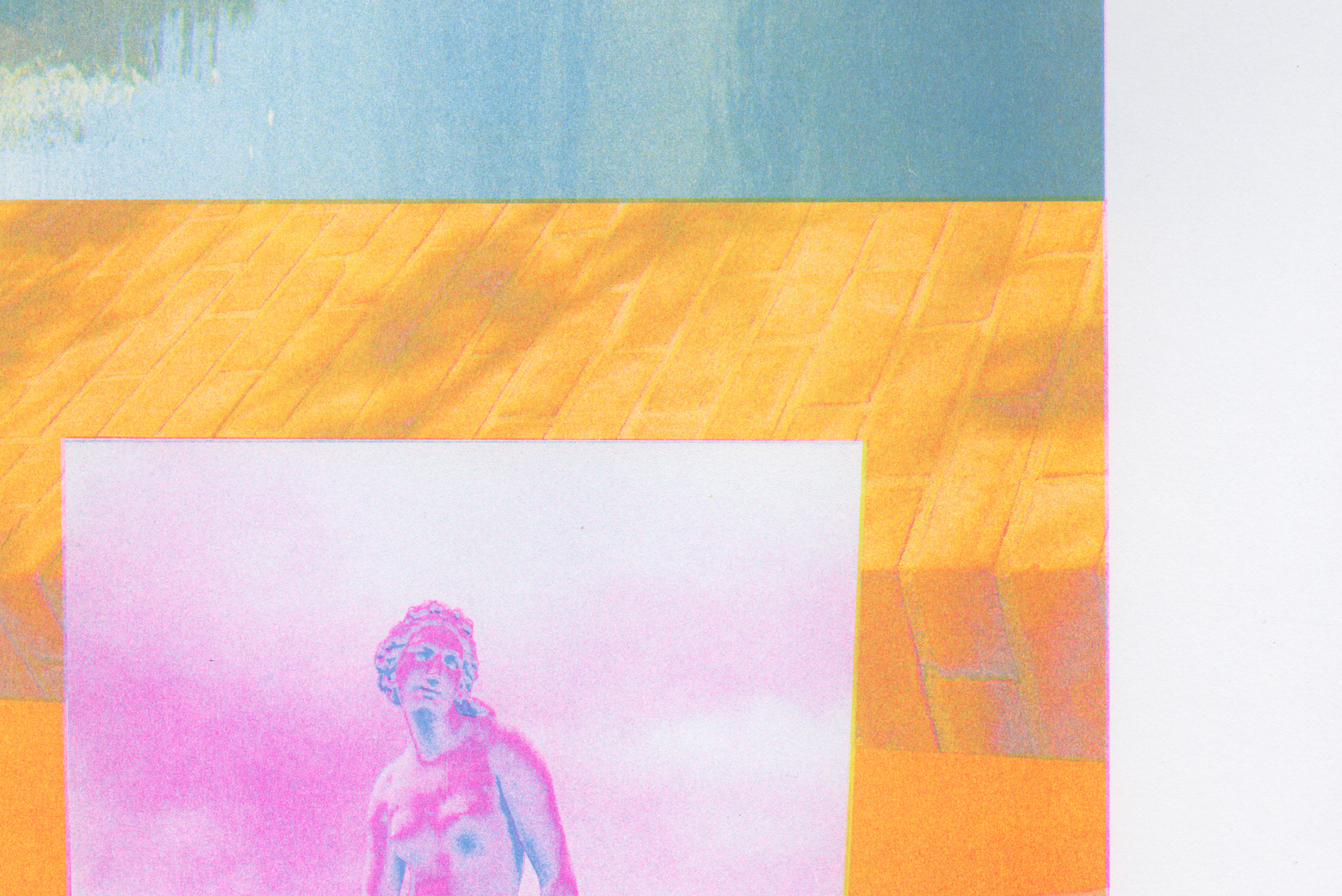
Connective Movements is a book that documents two years of visual research and experimentation at RISD's Graphic Design MFA program. The book is composed of a running narrative oriented horizontally with project documentation and interviews running normally.
Evicted was an exhibition that emerged from Matthew Desmond’s Pulitzer Prize-winning book of the same name. We worked alongside our architectural collaborators to develop an immersive exhibition experience that included houses turned inside-out and physicalized data visualizations to drive home the importance, intensity, and effect of the housing crisis in America.
Client: The National Building Museum Art Direction: mgmt.design Architectural Collaborator: Matter Practice
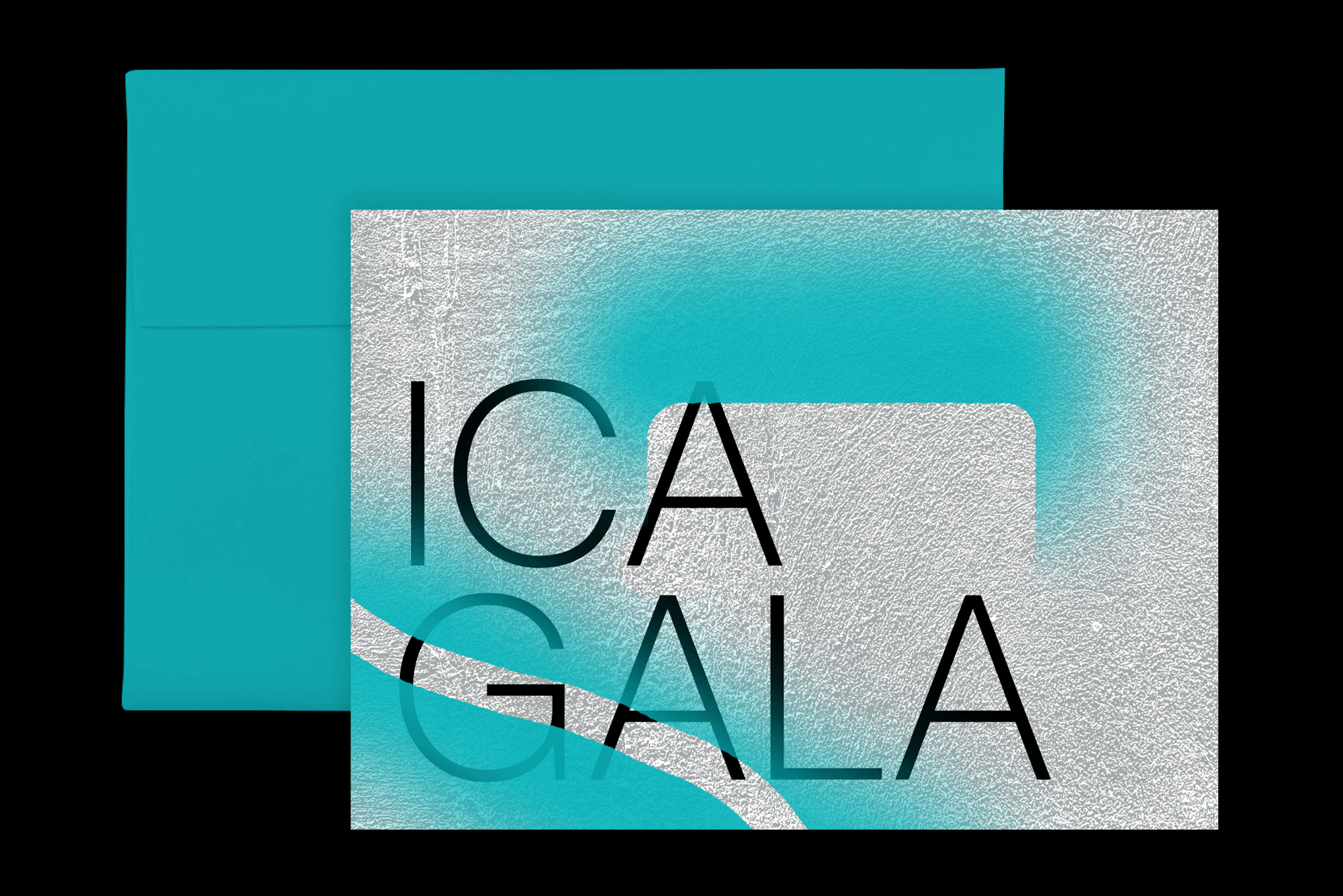
The direction for this year’s ICA Gala was inspired by the venue of the event: ICA’s Watershed Building. The Watershed is a former copper pipe factory located on the East Boston waterfront in a working shipyard. The texture was taken from its walls with color overlays referencing traces of spray paint found around the venue.
Client: The Institute of Contemporary Art / Boston Creative Direction: Angela Torchio
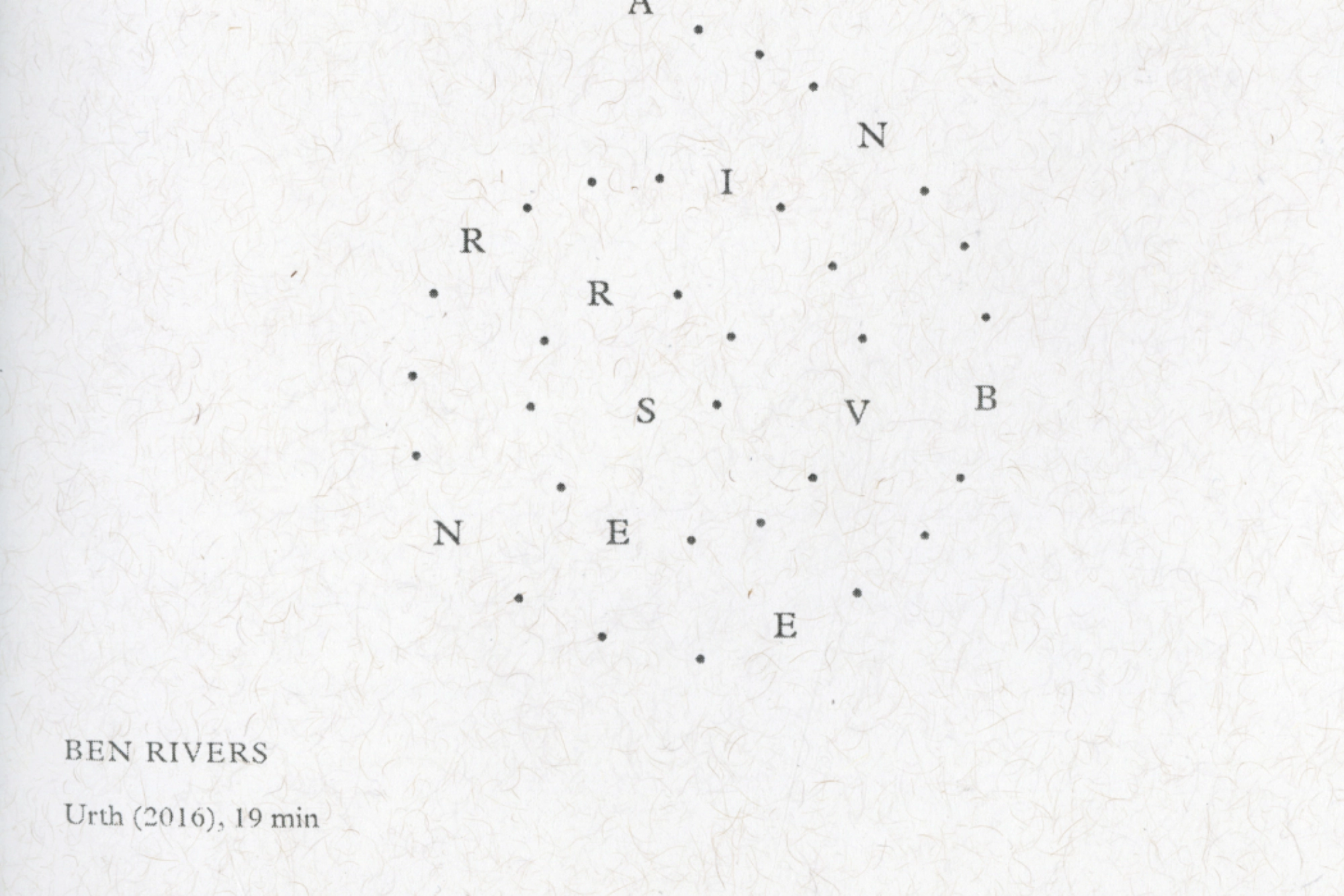
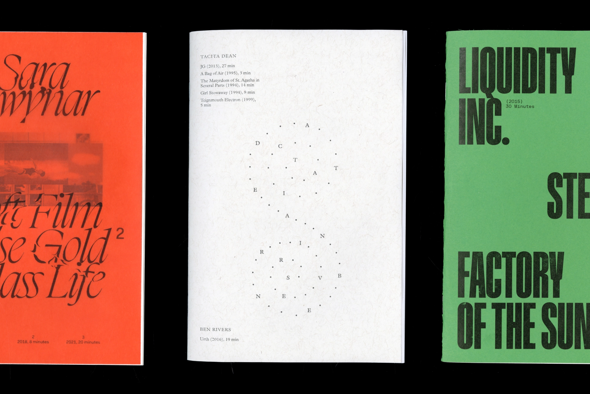
While in grad school, I organized a series of film screenings in fall, winter, and spring to open up my research into graphic design and film. The screenings took an iterative approach to film selection, scheduling, and visual output as I found out what worked best each time a series was shown.
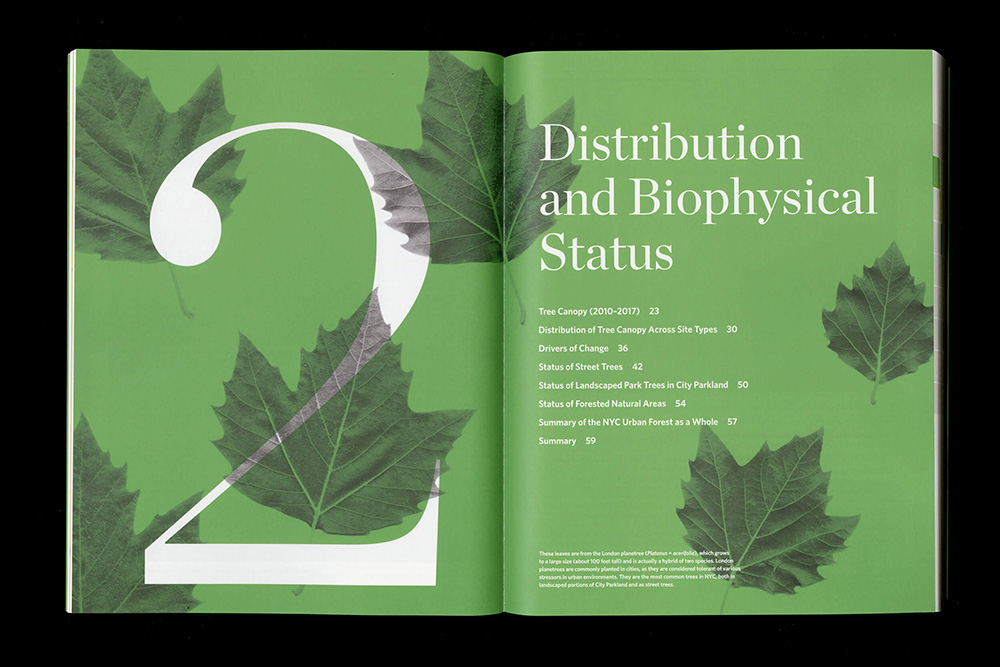
The Nature Conservancy first described this project to us as being “the Wiki of NYC trees” and we were hooked from that moment. This publication collects their research in a browsable, networked volume which is both usable for expert consultation while offering entry points for others. The book includes over 40 data visualizations and uses leaves from common NYC trees on the cover and section openers.
Client: The Nature Conservancy Art Direction: mgmt. design
The Space Between is a publication showcasing a body of work by artist Daniel Heyman. The work—which includes woodblock prints, japanese folding screens, and scrolls—are the outcome from his many trips to Japan and his enduring relationship with the Awagami Paper Factory.
McGlue is a text typeface designed for Ottessa Moshfegh’s novella McGlue (2014). Inspired by Latin serif typefaces like Portrait, McGlue is designed to cut and bleed.
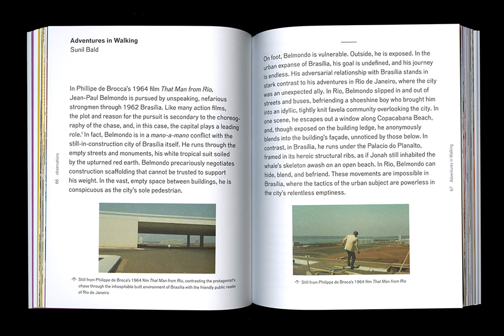
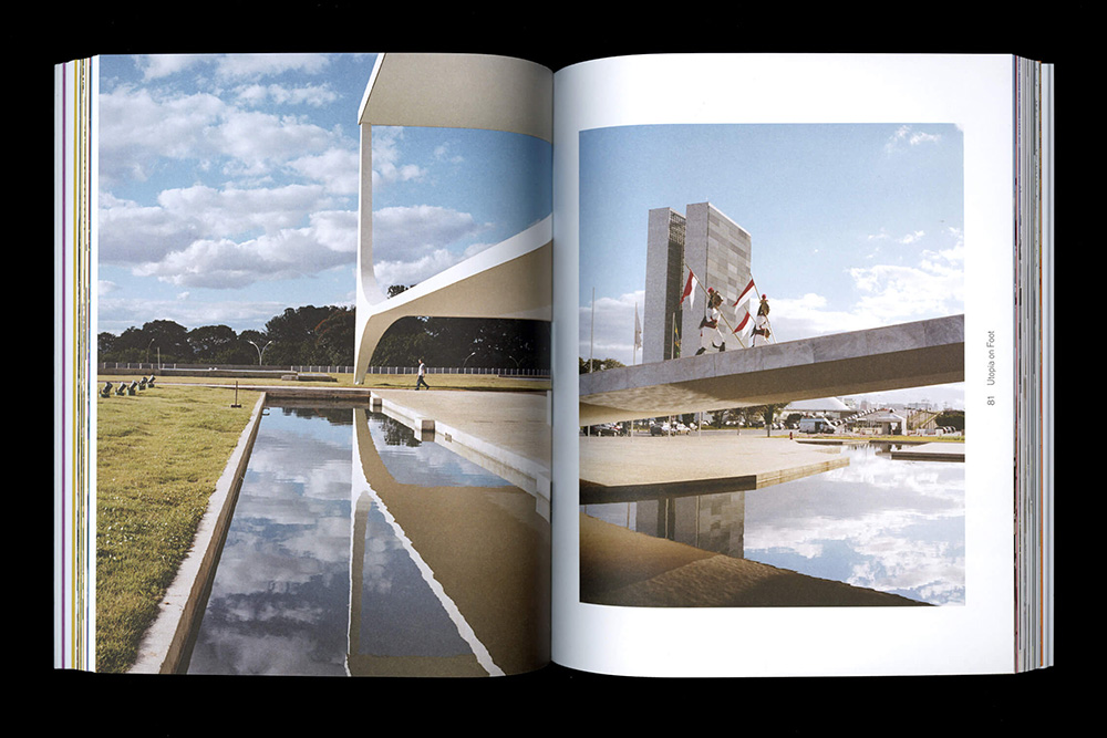
The Yale School of Architecture’s Bass series of books collects the work from the Bass Architecture Fellowship studio. For the 11th entry, the MArch students imagined a new city in Brazil, positioned between its capital, Brasília, and the outlying suburbs. The essays in the book think through the experience of the city at the scale of the body, walking, and analyzing the Modernist utopian legacy of Brasília.
Client: Yale School of Architecture Art Direction: mgmt. design
As You Zoom In, You Zoom Out
Motion
As You Zoom In, You Zoom Out is a riso animation that appropriates the Cold War scientific vision of the Eames’ seminal The Powers of Ten (1977) and twists it into a paradoxical loop. As you zoom into the absolute micro level of things, you find yourself back out in the macro.
Dialectics of Entanglement was an exhibition that restaged and revisited the Ana Mendieta-curated Dialectics of Isolation from 1980. From the wall texts to the labels to the publication takeaways, we put the past in dialogue with the present.
Client: A.I.R. Gallery Art Direction: mgmt. design
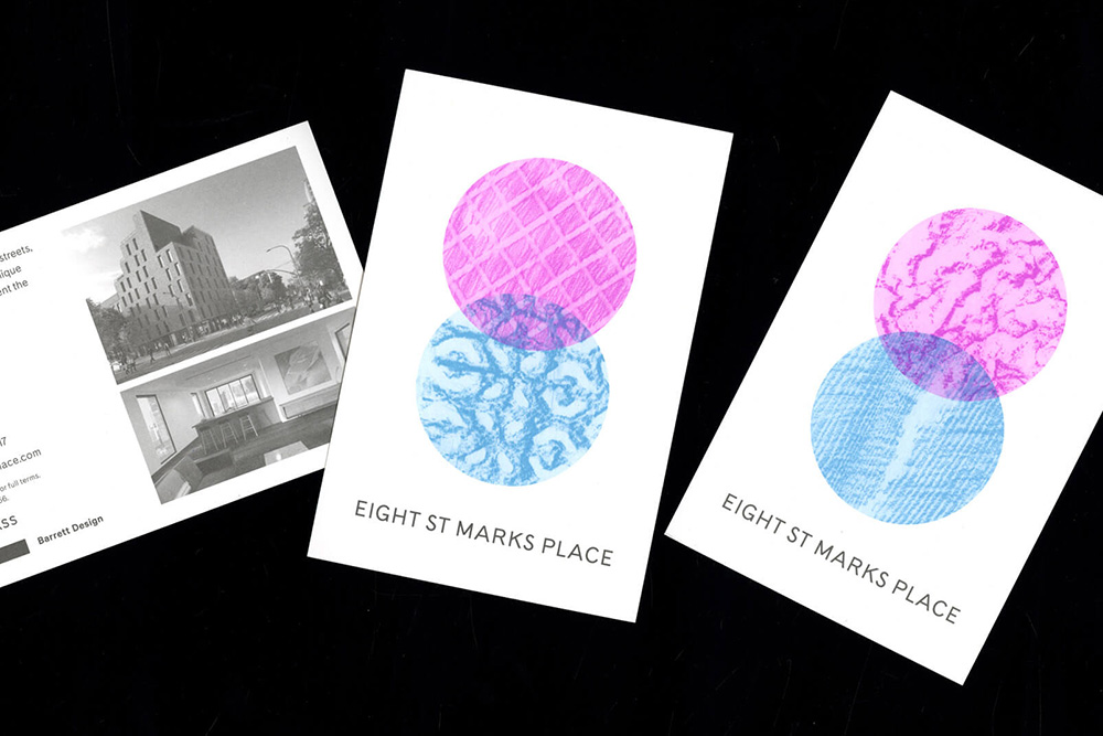
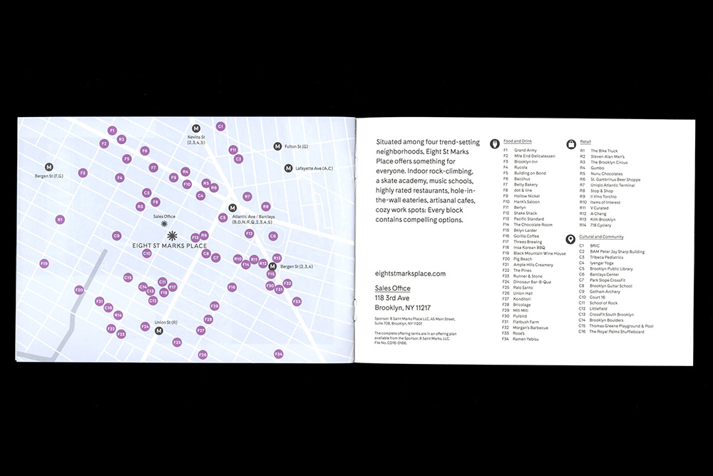
Eight St Marks Place is an architectural development situated at the overlap of two neighborhoods in Brooklyn. The textures for the dynamic logo were made using rubbings both from high-end materials used in the interiors of the apartments alongside the textures of the neighborhood itself. Deliverables included postcards, a publication, a store front, and tote bags.
Client: Barrett Design Art Direction: mgmt. design
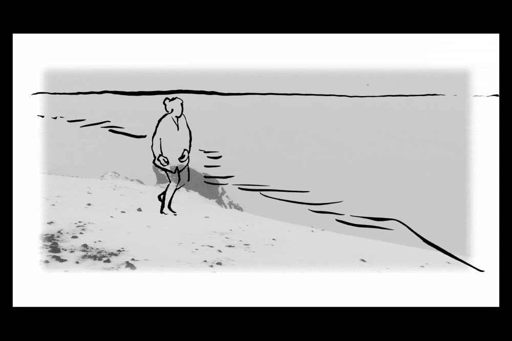
In Words is a video exploring interiority and the personal, experiential dimension of language via four open, winding conversations based on an initial word association. The video includes frame-by-frame rotoscoping.
Featuring: Lian Fumerton-Liu, Moritz Lónyay, Sadia Quddus, and Ásta Thrastardóttir
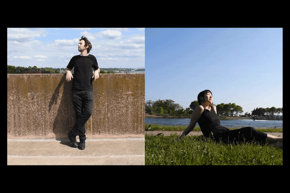
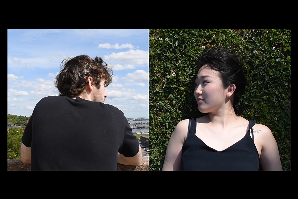
Between is a split-screen video inspired by the writings of Martin Buber (who is quoted in the middle of the video) and asks the question “what is communication?”